Brain health struggles and memory loss bring grief, a painful unravelling of self and time. Memories become patchy, fleeting, and sometimes entirely obscured. Yet amid the uncertainty, moments of love, presence, and awareness remain. Using an X-ray lightbox and curated slides, the work captures the tension between disappearance and persistence. Memories aren’t linear; they remain traces of light, reconstructed and shifted through emotion and time.
Grateful to Ian and the Telegramme team for their support of my project and for featuring it in the store during the DesignTO 2026 festival Jan 23rd-Feb 1st see more here.
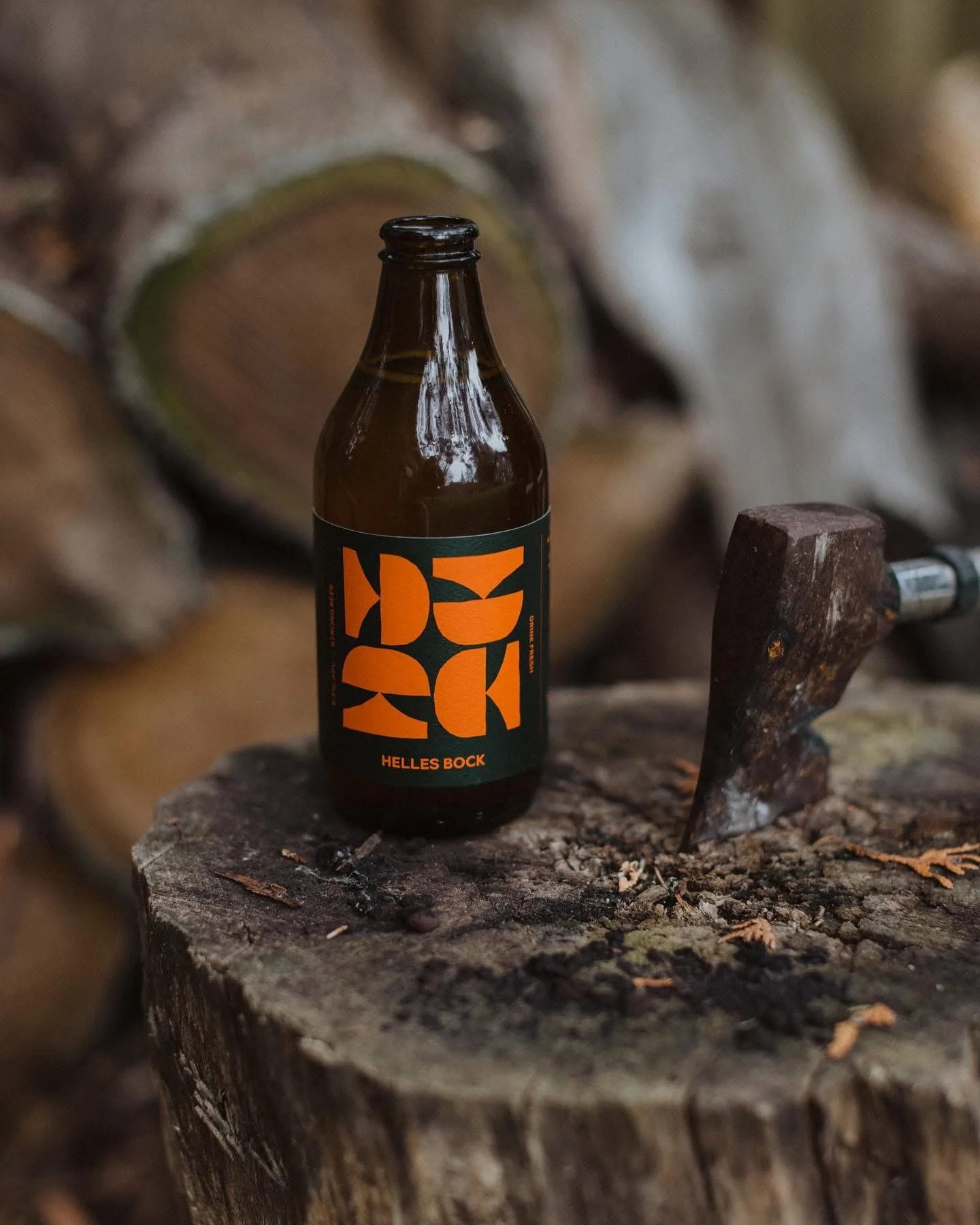
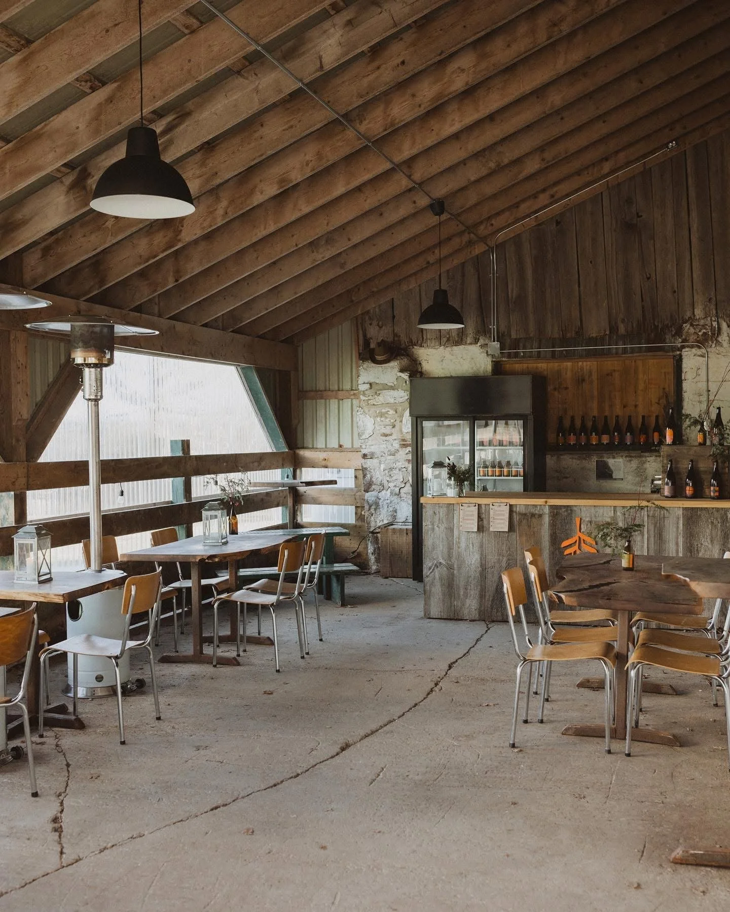
Passage Brewery is a limited-batch brewery in Collingwood, Ontario, exploring the art of slow brewing. Illustrated postage stamps reflect the local area as it journeys through the seasons. Every beer is hand-bottled and numbered by Owen Roth, the owner and brewer, making each one unique and collectible.
Creative Directors/Designers: Mike Withers & Lisa
Photographer: Jaclyn Roth
Applied Arts Alcoholic Packaging Series
Communication Arts Design Shortlist
Order online directly or see here for where to buy. For a more curated selection, join Bespoke Barrel Society, an exclusive membership program.
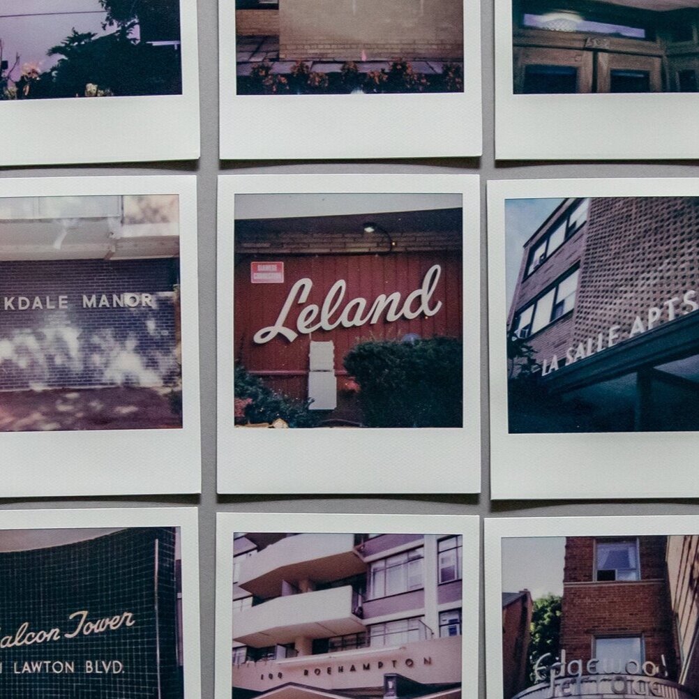
Out of a need to leave my place and explore I started to document the typography of various older apartment buildings with Polaroids. I fell in love. It became a treasure hunt of unique discoveries, some I happened upon while others I tracked down online. The charm and character from decades past led me to daydream of what these apartments must look like inside, or how they appeared in their prime. These signs show a lost typographic art form, one I wish that new developments in the city would bring back.
Project selected for DesignTO Festival—Canada’s largest celebration of design. It was recognized by Designlines and AZURE as one of the must-sees.
Grateful to Ian at Telegramme Prints & Custom Framing on Ossington Avenue in Toronto for displaying during the festival. Highly recommend for all your framing needs they are the BEST.
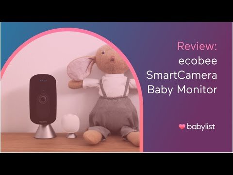
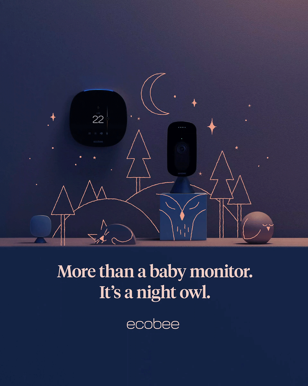
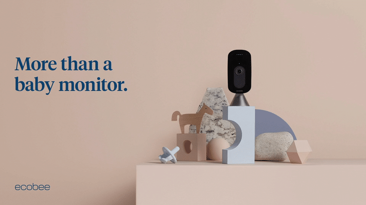
The Project Goals: Following the launch of the SmartCamera in 2020, ecobee received feedback that customers were using the camera as a baby monitor. ecobee engineers, researchers, and UX team members worked with new and existing features to eventually offer continuous audio monitoring, two-way talk, and remote connectivity with no limits. The camera was then bundled with ecobee’s award-winning SmartThermostat with voice control to create the Sweet Dreams Baby Kit, the ultimate way to keep baby safe and comfortable. With product and features ready, the challenge became how to work within the existing brand and connect with an in-demand target to market a product that requires a high degree of trust.
Our Responsibilities: Paired as an Art Director, Lisa Stuve and Copywriter, Kaitlin Bernard, we provided creative direction on the following:
* Creative strategy and concept * Concept sell through and stakeholder review * Cross-team collaboration* Strategic budget management * Process refinement * Vendor selection and direction including Illustrator, Animator, Motion Designer, Sound Designer, Image Retoucher, Printing House, PR Partnerships, and Content Creators
The Audience Insight: We immersed ourselves in the brief, conducted interviews with the customer target, scoured the competitive landscape, and mined our own personal experience for inspiration. Through this, we homed in on the insight that new parents are overwhelmed by choice and overloaded with information. We suggested that to combat these negative feelings, soon-to-be parents often find themselves in a daydream-like state of planning. This includes selecting names from lists, getting inspired by nursery décor, watching must-have product roundup videos, and curating beloved parts of their own childhoods that they want to pass on. In other words, letting their imaginations run wild with what is possible. We reasoned that we needed creative that met soon-to-be parents in this mindset. We needed to inspire them with imaginative creative and speak to the parent they would hope to one day be. Also, contending with low brand awareness in a high-trust category, we knew we would have to pair this inspiring creative with content that convinced customers that Sweet Dreams Baby Kit was the right choice for them.
The Creative Solution: With a new feature launch and repositioning, it became important to work cross-functionally in collaboration with our counterparts in UX, Product, Web, Research, and Marketing. We lead journey mapping and brand-focused strategy sessions to ensure we brought the functionality to life in an approachable way.
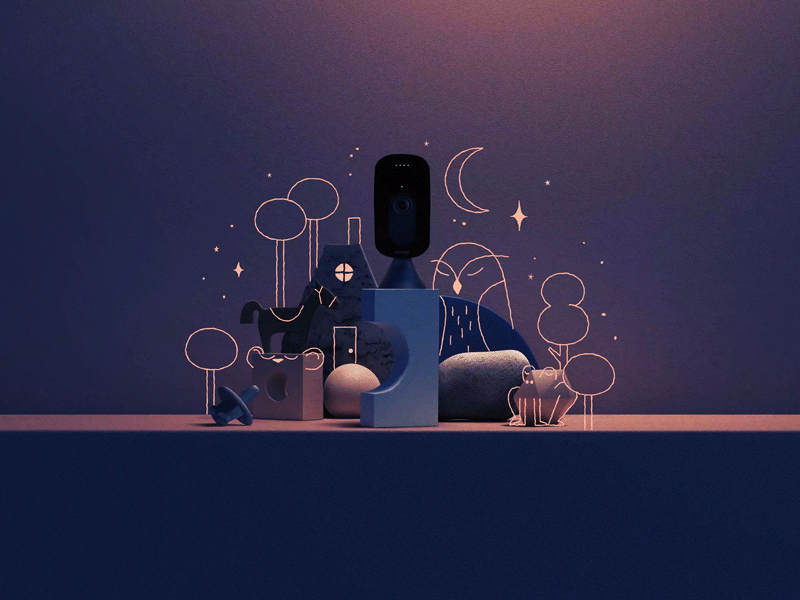
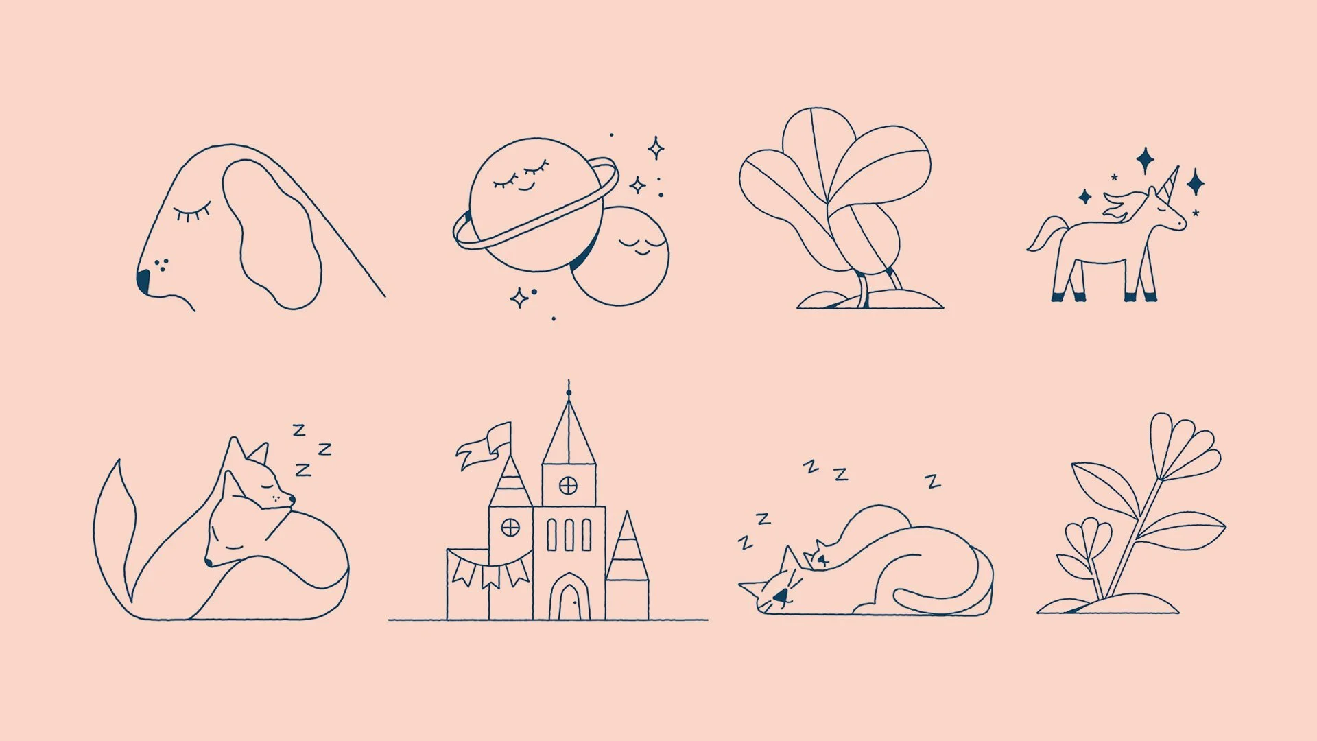
By using insight, we developed creative designed to capture the imagination and tap into the wondrous state of mind of soon-to-be parents. We leveraged existing still life product photography, created day/night iterations, and added imaginative illustrations featuring sleeping animals, unicorns, trees, stars, and more. With the copy, we differentiated ourselves in the category by pairing “More than a baby monitor” statements with a second statement that intertwined imagination and actual functionally of the product (e.g. “It’s a night owl” is a reference to HD video that works in the dark).
We also proposed content creators to create assets for the campaign, including lifestyle imagery, in-app video, and quotes. This lent authenticity to the campaign in order to build trust with the customers who are seeking advice in their important baby-related purchases. Overall, this approach was not only cost-saving, visually striking, and on-brand, but it allowed us to create content during COVID-related lockdowns.
The Results: Since the start of this campaign, 27% of cameras registered have been set up in the baby monitor mode. This campaign has included digital, social, influencer, and base marketing as well as PR. The launch has received significant press coverage in publications such as Today’s Parent, Fatherly, Motherly, The Verge, and more.
All tactics have performed above benchmark and have made our baby monitoring product pages the most viewed pages on ecobee.com (with the exclusion of homepage) since the start of the campaign. Due to the success of this creative, it was converted from a campaign with a set end date to become an always-on campaign within paid digital channels.
Why it Worked:
• In a sea of sameness, we amplified the traits that are unique to our product and brand.
• Connected to our brand purpose with story of imagination and constant innovation.
• Every single execution told a story connected to a product feature or benefit.
• A flexible yet consistent system that worked across all creative touchpoints, ratios, and specs.
• Knew the target and produced insight-driven creative + product and feature-driven executions to create new target-specific sub-brand and that connects with customer needs.
• Authenticity of telling real people’s stories through content creator partnerships and real life in-app video clips in social videos.
The Creative Collaborators:
Sarah Beth Morgan- Illustration
Tyler Morgan- Animation
Quewin Warnasuriya/Aaron Gaistman - Toronto Sound
Sean Kung- Motion Design
Stephen MacLeod- Retouching Still life
Dreamy creative that appeals to the imagination and childlike sense of wonder of first-time expecting parents. Designed in contrast to the advice overload and sea of smiling babies that’s served to this target on Pinterest, Instagram, and Facebook.
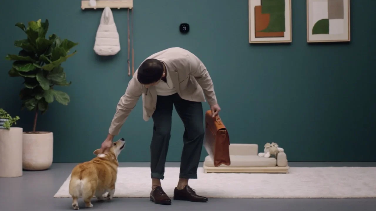
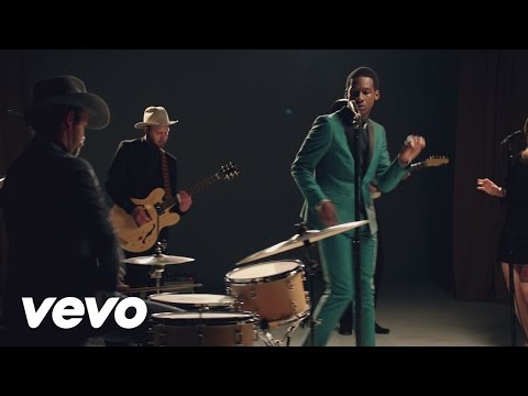
For the highly anticipated launch of two new ecobee thermostats, we connected product benefits to fun and captivating real life scenarios to amaze customers. Paired as an in-house creative team of Principal Art Director, Lisa Stuve and Associate Creative Director of Copywriting, Kaitlin Bernard, we conceptualized and oversaw production of a range of assets, including awareness-level video.
We connected with the Product team to really understand the benefits, research insights, and functionality of these highly technical devices, while working closely with Marketing to depict scenarios that would best illustrate the reasons to believe.
Working closely with our external partners, I defined and oversaw art direction, sound design that grabbed attention and showed results. The campaign exceeded targets and was extended due to its success. People shared their own Corgi photos under the beloved Mr.Ruffles social videos ads.
Mr.Ruffles was so popular with 9.5M impressions he is now enjoying a career in Hollywood.
Creative Collaborations Videos:
Production: Day Job and Makers
Set Design: Karl & Dom
Sound Design: Toronto Sound
Makeup and Hair: Romy Zack
Stylist: Carla Candela
Creative Collaborations Still Life:
Nathan Lang, Photographer
Roxanne Chagnon, Stylist
Rodeo Productions
After a large rebrand, paired as an Art Director, Lisa Stuve and Copywriter, Kaitlin Bernard we were tasked with creating visual assets for the B2B ecobeePro channel, which is responsible for a large portion of the company’s revenue.
These images would be seen by busy contractors, HVAC professionals, and builders facing the demands of running their own businesses. Imagery had to speak directly to the Pro while also staying on-brand with the consumer-facing look and feel. We also interviewed real contractors to gather insights.
We decided to lean into the brand element of Elemental to connect to our over all brand visual style that was unique to ecobee. A less is more approach gave us a clear focus on the products, enhanced with grey scale surfaces and natural building elements that the Pro is familiar with (e.g. bricks, natural rocks, glass, unfinished drywall).
The end result delivered on the seamlessness with which the products fit into the Pro’s work.
Creative Collaborators:
Nathan Lang, Photographer
Roxanne Chagnon, Stylist
Rodeo Productions
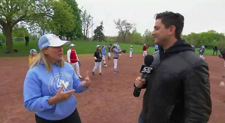
Dana Bookman is the founder and CEO of Canadian Girls Baseball and the VP of American Girls Baseball. She started Toronto Girls Baseball for her six year old daughter, who loves the game, but wanted to quit after a season of being the only female player in a league made up of 400 boys. It grew 840% in the first year alone, and has served almost 1000 girls so far. Today, Canadian Girls Baseball is the only all girls baseball league in Canada. They offer development leagues & programs for girls aged 4-16 and teach resiliency through sport.
Canadian Girls Baseball had a challenge to simplify, streamline and strengthen the brand identity. Brand needed to look, feel and sound empowering, refreshing and caring. The solution required a strong visual idea in order to ensure long-term preservation and strengthening of the organizations unique position. Design needed to work within a one colour design system to ensure practical print flexibility for uniforms and merchandise.
Different concepts were explored before creating a true league logo that drew on the strength of not only the CGB founder and players, but true perseverance of the game and history. Drawing inspiration from Otis Shepard who designed all visual elements of The All-American Girls Professional Baseball League and Mary 'Bonnie' Baker a Canadian who played more games in the All-American Girls Professional Baseball League than any other player. Using symbolic imagery with midcentury design cues, we created an effectiveness and immediacy for a memorable design.
I had a custom pennant created by Oxford Pennant to debut the new CGB branding. The best was the drawings from the members of the logo. It warms my heart every season seeing the pride of the uniforms and medals.
Creative Collaborations:
Illustration & Lettering: Michele Rosenthal
Photographer: Jaclyn Roth
Communication Arts 2019 Illustration Shortlist
Official Rawlings Buy Here
“Lisa created our Canadian Girls Baseball logo and put her heart and soul into making it something meaningful and timeless and, hopefully, iconic. I couldn’t be happier or more appreciative of the effort and the end product.” -Dana Bookman
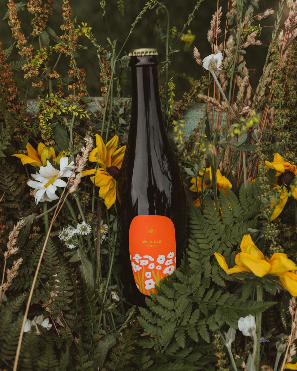
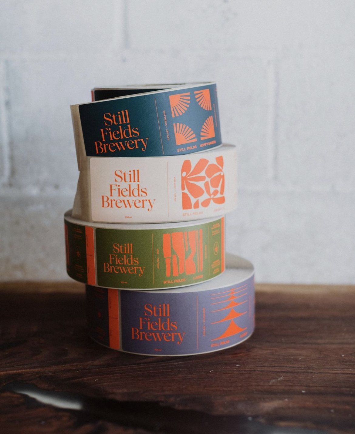
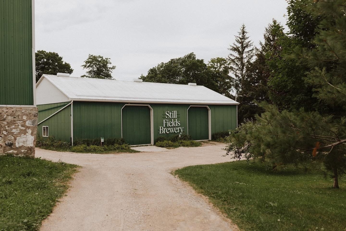
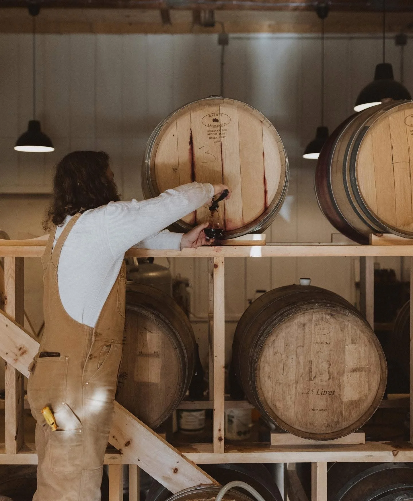
Still Fields is a brewery with a focus on traditional oak-barrel brewing and craft, while experimenting with unexpected flavours and locally grown ingredients. The design reflects the contrast of colours seen on the farm: vibrant fresh produce and a more muted palette of grains, earth, and Lake Huron in the distance. Each label has a unique pattern, referencing the 'barn quilts' seen throughout the region (large painted signs on barns that tell stories about the people and area.)
We commissioned artist Jeffrey Sinich to create a custom quilt of the Icon for Still Fields.
Creative Directors/Designers: Mike Withers & Lisa
Photographer: Jaclyn Roth
Printer: Bleed Printing
Still Fields: Owen Roth, Jacyln Roth, Steve Ormsby
Communication Arts Award of Excellence for Design
Applied Arts Alcoholic Packaging Series
The ADCC Packaging Design, Series Bronze
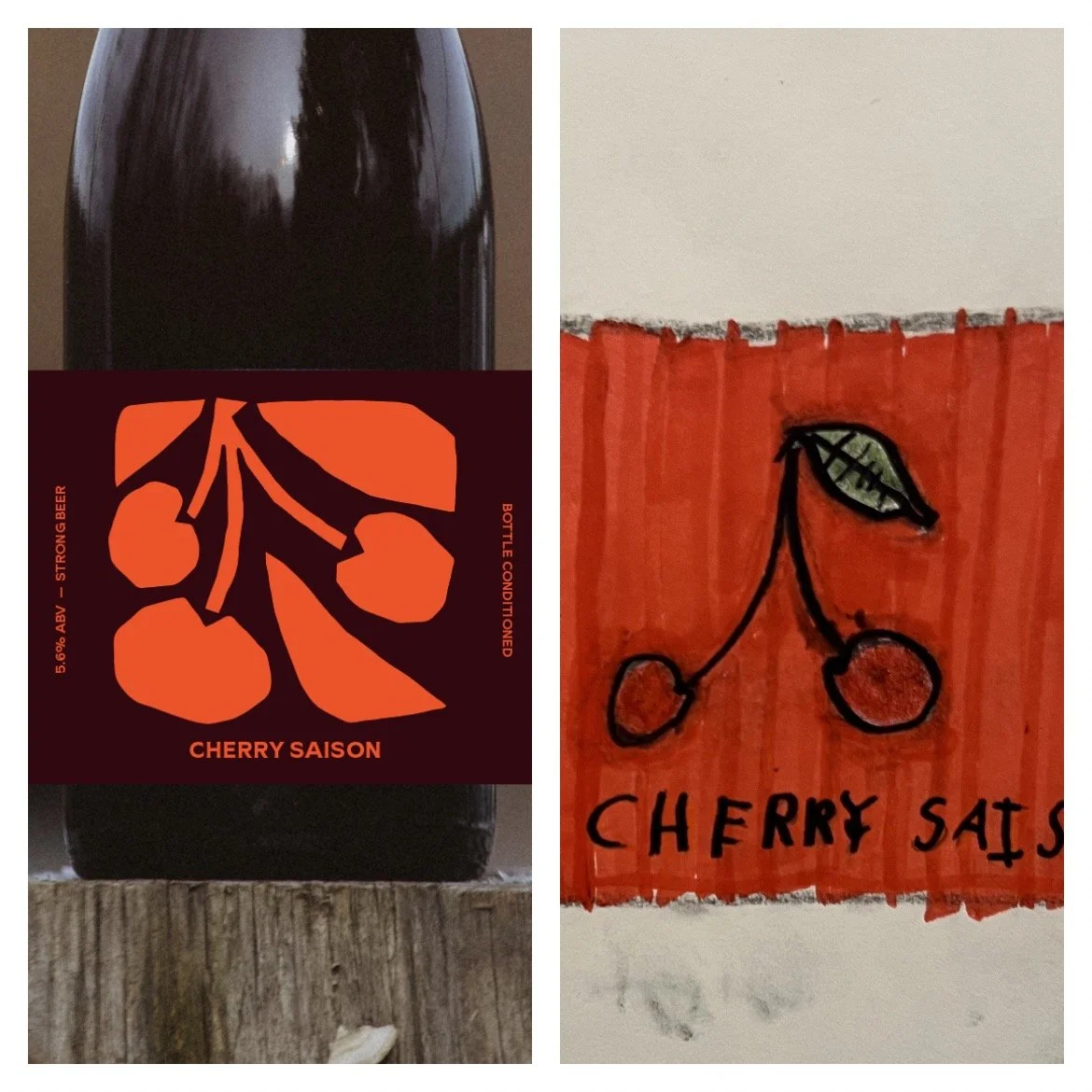
Owen Roth and Jaclyn Roth have now launched Passage Brewery in August 2024. Mike Withers and I worked on the branding and label designs. Project feature here you can order online directly or see here for where to buy. For a more curated selection, join Bespoke Barrel Society, an exclusive membership program.
My nephew Lincoln was a design intern for us this is one of the designs inspired by his drawing.
Project goals: The launch of the new ecobee Whole Home smart ecosystem required a bold visual style to match its game-changing technology. With a family of products to introduce to a crowded marketplace, everything had to work together seamlessly and get the attention of distracted shoppers. We set the goal of creating an asset library of photography that was both striking and ownable with our rebrand, while also versatile enough to be used in any marketing channel or placement regardless of size ratio requirements.
My Responsibilities: Creative strategy and concept, on-site planning, artists selection, stakeholder review, retouching direction, final art selection, cross-team collaboration.
Audience Insight: While ecobee traditionally appealed to tech-savvy users, the new products were suited for mainstream users who are focused on simplicity. As such, the visuals needed to be reimagined away from technical features and towards an accessible concept around value: these products helps consumers to flourish through achieving sustainability goals and practical cost savings. While life can be chaotic for frenzied families, ecobee’s new brand system had to show how the products faded into the background, adding valuable automation to everyday life.
Solution: To drive confidence in ecobee, a unified visual style had to align with the consumer’s desire to add tasteful and practical upgrades to their home. The art direction reflects a calm, surreal aesthetic of modern family life.
By collaborating closely with product design teams (including product managers, ux/content designers, and researchers) and marketing/web teams, I led the development of a strategic visual approach to product photography. This concept of products integrating harmoniously to simplify life at home became the creative North Star for all visual elements. My direction was to create still life compositions of the products that aesthetically communicated our brand attributes and our products functionality while elevating the industrial design of our products in a unique and ownable way.
Why it worked: The material palette allowed the products to sit at various heights within the compositions, offering a sense of balance and intrigue that guides the eye pleasingly through an expression of each colour story. This aligned with our brand attributes of harmony, elemental and wonder. Colour directions further guided our visual storytelling for each environment’s elements (Harbour, Peak, Bastion and Hearth) that connected to our core brand purpose of improving everyday life while creating a more sustainable world.
Commissioning world class artists Jess Bonham and Anna Lomax was a dream come true. They developed a unique treatment of painted plinths to use colour to change horizon lines within the compositions allowing for various ratios. This offered depth and richness to the images in a way that confirmed they are genuine, physical environments and products. We were able to capture essential lighting that brought mood and intrigue to the visuals and with Anna’s natural material palette collection we were able to give the ecobee products an iconic presence.
Creative Collaborations:
Photographer: Jess Bonham
Set design and styling: Anna Lomax
Product retouching: Stephen MacLeod
Historically, a harbour represents a point of safety, communication and conduit for innovation and exploration. This colour evokes the ease with which human needs can successfully harmonize with nature through technology.
The heart of the home, a hearth represents balance by being able to control fire and harnessing it as a cornerstone of family life. Similarly, this colour taps into the warm feeling of comfort created by the connected home.
The wondrous feeling of viewing things from the top. This colour represents the clarity and vantage point that is achieved when one has effortlessly scaled the summit of adopting new technology.
A bastion is the elemental building block of any structure. Its staying power offers shelter as well as sustainability. It is fitting that the bastion colour carries on the legacy of green as the original ecobee brand colour.
“The product and lifestyle photography is bananas. I haven’t seen art direction and photo production of this depth in a long time. Every little detail, from the weird minerals in the product shots to the selection of plants in the lifestyle shots, has been so carefully considered. The lighting, the scenes, the materials… everything is so well thought out and so… different.” - Brand New , Best of 2020 Series for Photography
Goal was to appeal to people who would relate to seeing the ‘Frenzied Family in action’: They care about making sure bills are paid and the dogwalker has keys, but also playing with the kids and having enriching experiences amidst all the comings and goings of home.
With this insight I created a lifestyle photography library in the direction of warm, authentic and familiar to capture the ecobee brand and be used communicate product features. For the ecobee Pro B2B lifestyle, I used a real HVAC Pro to ensure authenticity to the shots. This photography has been used across multiple channels and in press coverage. A few selected images from a library of over 30 photos for the product launch of SmartThermostat with voice control. ecobee was awarded 'Brand of the Year' by Strategy Magazine following the launch.
Getting to work with the incredible photographer Nikki Ormerod and Westside Studios for this project was a pleasure. Thanks to Raj gets it done.
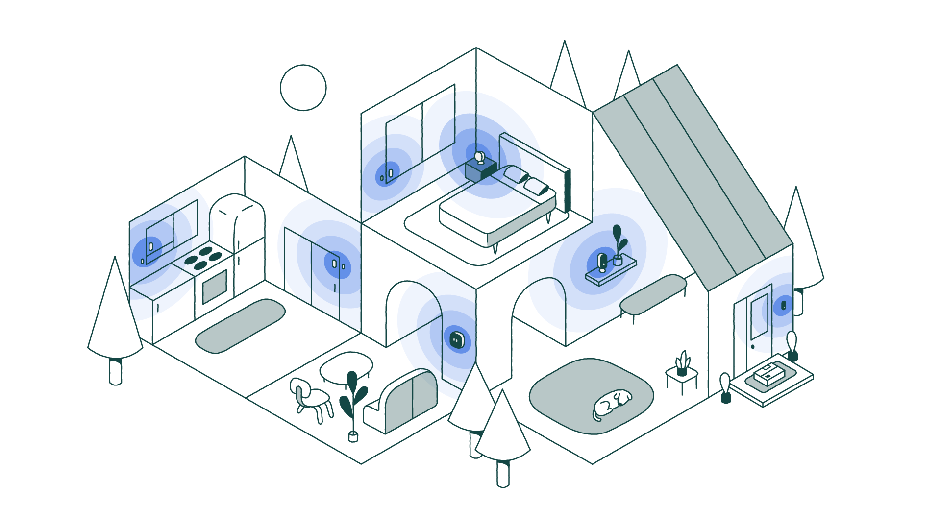
Collaborating closely with industrial design, product design and bringing in our external illustration partner Sarah Beth Morgan, I led the development of a new strategic and visual solution for product illustrations. We needed to create something ownable for ecobee that could communicate how the products worked together in a connected home overview. Creating a system for where brand and engineers meet. We also needed to consider the installation guide for the ecobee app to ensure system was flexible and scalable. The entire system has been used by multiple teams and we created an illustration design guide to be able to develop any future illustrations and to inform our technical illustrations.
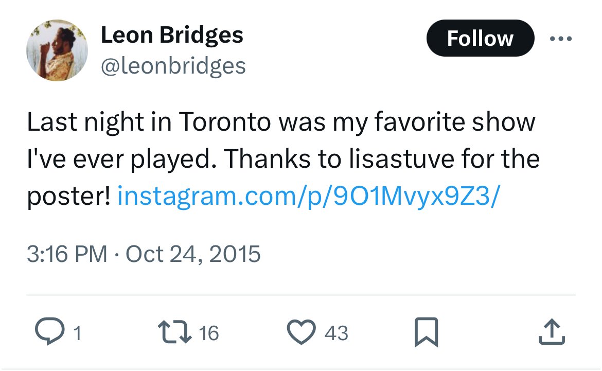
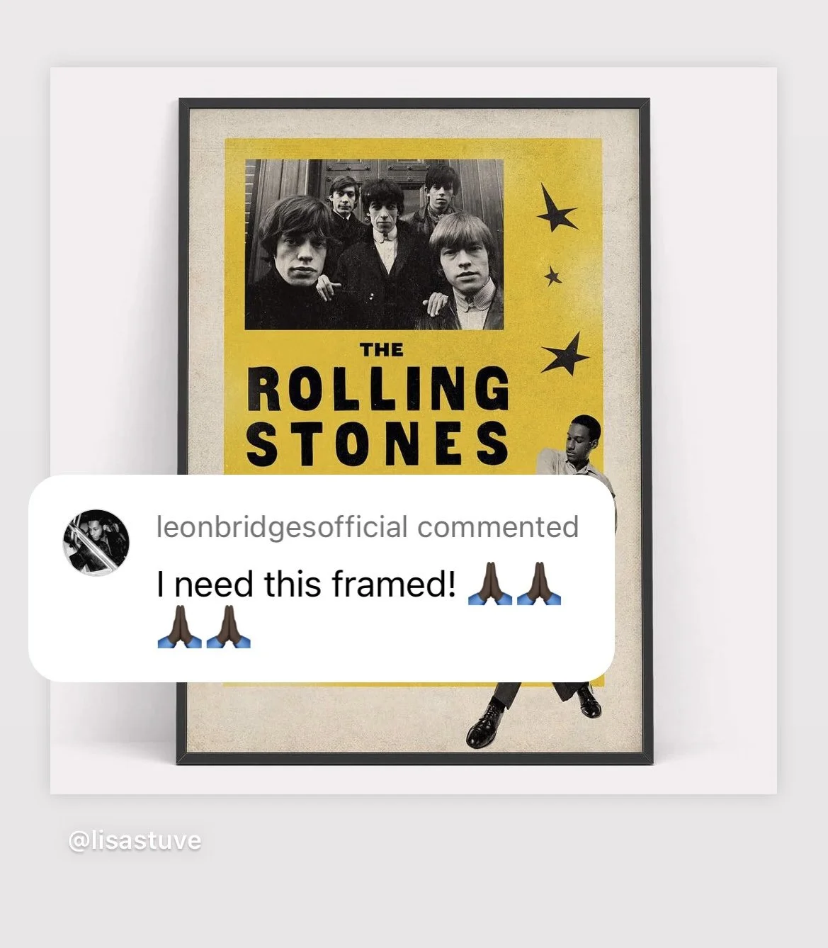
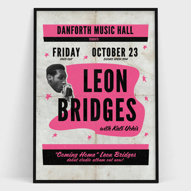
Leon Bridges has a very ‘50s/‘60s soul music sound. Inspired by the posters of that era, I designed this poster for Leon. Thanks to Michael Sherman from The Danforth Music Hall for getting it to the man himself who just happened to love it!
I also made a Leon Bridges poster when he opened for The Rolling Stones. He loved it so much had me print and send it to him.
As a cocktail lover this is one of my favourite clients and projects. I designed the book menu and various creative items for Famous Last Words a literary themed cocktail bar in The Junction. In partnership with the talented Kerri Minns from Cobalt & Colver who designed the logo, interior elements and beautiful book wall. Famous Last Words has has been featured in The Toronto Star, Global News, Gin Mag and more.
"Lisa started out by creating our book menus and overall design aesthetic for famous last words, and has gone on to create posters, social assets and POS material over the past five years for us. She has a keen eye for design, a seemingly endless well of creativity, and an inherent sense of how to seamlessly connect her vision across multiple platforms. Passionate, flexible and collaborative, Lisa is an absolute pleasure to work with." - Marlene Thorne, Owner Famous Last Words
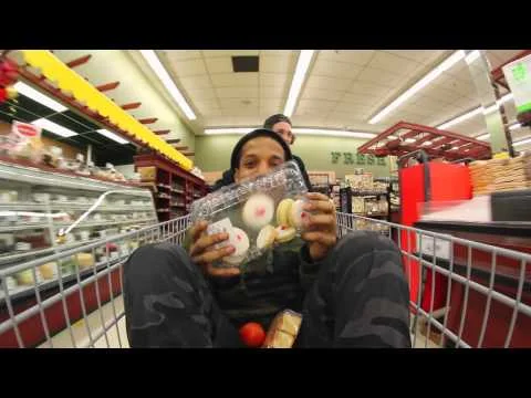
Getting to shoot inside a grocery store at night was exhausting but so much fun. Thanks to Marilus Market for having us.
Responsible for: Creative development, art direction, project management and execution of national promotion in collaboration with design, online, buying and visual merchandising teams. Campaign elements included in-store displays and signage, an online lookbook, social promotion and contest.
Creative Collaborations:
Photographer: Harry Gils
Design/illustration: Dan Brandon
Video: Pasi Posti
Finding out how to get custom 3D glasses made and shipped into Canada was a challenge but really made the promotion. The interactive element for our windows and online was very well received.
Responsible for: Creative development, art direction, project management and execution of national promotion in collaboration with design, online and visual merchandising teams. Campaign elements included 3D windows, in-store displays, an online 3D lookbook and contest. Customers received a free pair of 3D glasses in all stores.
I’m fortunate to have collaborated with an incredible team of colleagues, brands and agencies to help make these events happen. Select photos and videos of various events I have worked on.
Involved a variety of roles that include: creative strategy, event theme and concept development, event marketing and promotion, event planning and project management, and also brand partnerships.
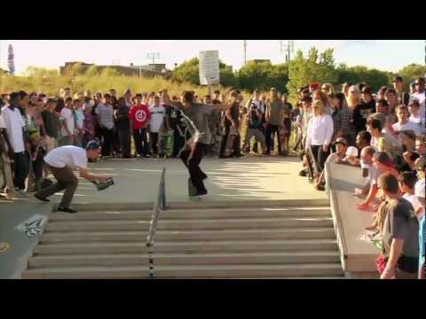
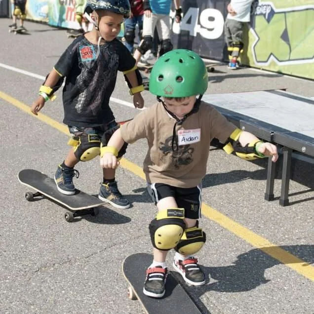
Our founder Sam Baio’s vision, a one day free educational event providing an introduction to skateboarding for, age 5 to 15 with 35 + stops across Canada. Lessons on safety, setting up a board and demos from our staff/ flow team riders. Awarded the Retail Council of Canada’s Award for Corporate & Social Responsibility 2012 with our partner eventSing. Sam now runs Socks for Change, please donate.
Demo and signing in promotion of a custom Etnies exclusive colour way for West 49 stores. Ryan Sheckler, Cairo Foster, Matt Berger, and Stacey Gabriel skating the West49 in West Edmonton Mall.
In "Crossing Canada" the Element team linked up with West49 for a series of demo's and signings.
West 49 stores celebrated with riders of all ages and skill at local skateparks in their neighborhoods. Stores hosted hosting contests, demos, games of S.K.A.T.E., BBQ’s and fundraisers for local charities and prizes from our incredible partners at 55+ local skateparks across Canada. Illustrated by Dan Brandon.
Since 2002, more than 88,000 winter coats have been distributed as a result of the Coats for Kids program. Each of the 70 West 49 stores across Canada donate coats to local charitable organizations to help families in its community. In 2013 ‘Spread the warmth’ a new concept and tag line for the program. Illustrated by Dan Brandon.
Customers were able to have their Toms customize in partnership with local artists or paint their own to support the Toms ‘One for One’ movement. Blake Mycoskie Founder and Chief Shoe Giver of TOMS, left Kerry Casarin Senior Buyer and I.


![ECOBEE-IMG_9387[22]-LAYERED_FINAL01.jpg](https://images.squarespace-cdn.com/content/v1/570d06d4f85082ada611883b/1742149639261-DOFJD0HTVQ051HZ9EYHU/ECOBEE-IMG_9387%5B22%5D-LAYERED_FINAL01.jpg)